Story of the main visual
The most important aspect of the campaign is the main visual representing the campaign and its ideology. The campaign name is “Enjoy Our Differences” and to represent that, we have used the colours of the flags of Japan and India. In “OUR”, the “O” represents the flag of Japan and the “UR” represents the flag of India. The whole concept was to show the differences and similarities between the two countries.
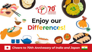
The pictures chosen for the main visual represent different food cultures of both Japan and India. To represent the community, we have used the image of an Indian and Japanese woman to differentiate (from top left). To represent the food cultures of Japan and India, we used the most common food, “rice,” which matches the food culture of India, as well as the Indian tortilla (from top centre to bottom left).
The campaign is also about exchanging cultural values between both countries. Therefore, the Taj Mahal, also known as the symbol of love, represents the ancient monument of India that reminds us of our Indian cultural roots. Similarly, the Senso-ji, an ancient Buddhist temple, was rebuilt and is a symbol of rebirth and peace to the Japanese people. (Bottom right)
Another important aspect of the main visual is the appealing theme colours, which embrace the “differences” and “cultures” of both Japan and India. The theme colours used in the main visual are red, saffron, green, and yellow, which consist of the flags of Japan and India.
In Japanese cuisine, the five colours of red, yellow, blue (green), white, and black are used in cooking and serving to achieve beauty and nutritional balance. Additionally, the colourful differences symbolise the diversity of India and the different cultures of both countries. The colours are presented in harmony on a single palette. Japan and India have a long coastline in common, and the indigo blue line that represents the ocean represents the rich connection between the two countries.
So, we created three different main visual proposals using the above concepts.
A
B

C

To make sure that the visual is more audience-centric, we decided to do a one-day poll on Instagram (Online Survey) and an offline survey at universities, including people from Gen Z and Millennials. We received 219 responses to the survey. Below is the result of the survey:
- 79 people voted for A
- 97 people voted for B.
- 43 people voted for C.
To make the survey more practical and valuable, we asked the people to also provide any suggestions and opinions. The following are the responses:
- A is the main visual.
Comment from voters: There is more Japanese food on the poster. You can use the food that is popular in India to represent Indian food. For example, Jalebi (Indian Sweet), Idli Sambar, Dosa (South Indian Food), Dhokla.
- B is the main visual.
Comment from voters: The images are obscured by the text. Keep the original images without cropping them and adjust the text in the middle. The Indian woman in the upper left appears to be Japanese.
- For the main visual,
Comment from voters: The Indian woman in the upper left appears to be Japanese.
After getting maximum responses for the (B) main visual, we finalised it for the campaign. However, we realised that Indigo blue has a deep connection with the culture of Japan and India, so we replaced the initial colour with Indigo blue.
Indigo is one of the most common colors used in Japanese dyeing, and is sometimes called “Japan blue” in the West. Indigo is also the symbolic color of the Japanese national soccer team, and is said to be “the color of victory”. This color that represents Japan actually originates from India. Indigo is also a color that symbolizes the cultural ties between Japan and India, so we chose indigo among the blue colors because of the commonality of the sea.
![]()
This marks the beginning of the journey to find differences and similarities while sharing Japanese food and food culture. We would like you to experience the journey of exploration, listen to your voices, and discover something new between us.
Related Posts
Nothing found.